
Designers as Designers
Booklet Design
2024


This booklet explores the dynamic interplay between typesetting and content, challenging the notion that design should function merely as a transparent vessel. Drawing on Beatrice Warde’s The Crystal Goblet and Michael Rock’s Designer as Author, the design argues for a more assertive, narrative-driven role for typography.
Baskerville and Futura were chosen for their contrasting visual voices. Baskerville, with its classic elegance and high contrast, conveys the gravitas of Rock’s argument. Futura, defined by its modern, geometric structure, echoes the functional clarity endorsed by Warde. These typefaces become visual metaphors for the authors’ opposing philosophies.
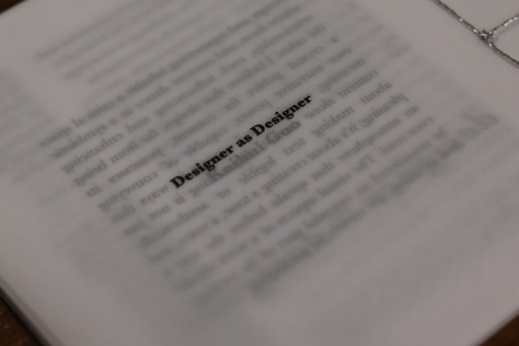
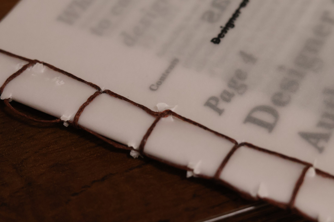
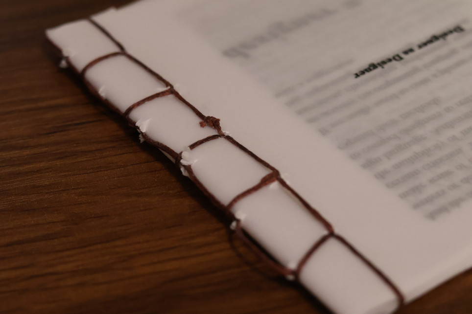
The two essays were selected to stage a visual and conceptual debate around “good” typesetting. The text of The Crystal Goblet is flipped to reject the passive role Warde assigns to design, making the layout itself a counterargument. Placing Designer as Author on odd pages and The Crystal Goblet on even pages reinforces this dialogue, with vellum paper enabling a layered, translucent interplay that reflects the complexity of the debate.
The booklet’s 5” x 5” format and Japanese binding with silver thread were chosen to evoke intimacy and craftsmanship. The front cover features the phrase “Designer as Crystal Goblet” in Futura, struck through to challenge the invisibility of design, while the back cover reads “Designer as Designer” in Baskerville, affirming the belief that design is not neutral—it shapes, influences, and authors meaning.


